When the majority of your negative NPS verbatims reference one experience, it's time to investigate it.
―
MY Role
Lead Researcher
When I joined my current team, it was a baptism in fire.
I swapped from a small tech incubator of ~5 members within IBM to the largest product team in our business unit, with ~200 members.
The swap happened in a matter of days. I was familiar with our product’s industry: Marketing. So that helped with getting my bearings. But I was switched to this larger team because they had a dangerously low NPS, with broad interpretations about the driving factors. My goal was to bring clarity to what was driving NPS, helping the team turn their investigation into an action plan.
*there were simultaneous studies we conducted to assess if there were other areas that might warrant quick wins for NPS. I will not be addressing those in this case study.
I knew going in, from categorization work done by previous reviewers, that Ease of Use was our largest NPS theme by a long shot - Ease of Use accounted for 70% of all NPS comments.
Clearly, our product needed some UX love and care. But with 15 development squads and ~30 distinct features contributing to a few primary user workflows, the team needed to focus.
We started by breaking down the Ease of Use theme into categories.
One workflow in particular needed some love: creating/sending a marketing communication. After discovering this, the product team’s first reaction was - let’s just revamp the UI, then!
How likely are you to recommend…
Landing and email design could be better
You should focus on the editor
it's difficult to design in.
But, as you can see from the samples above, commentary was too vague to result in just a facelift. There was further investigation needed to inform how we should overhaul the experience.
What we needed to learn
Our goals going in were to understand:
who creates/edits communications
what is their process for creating/editing communications
which capabilities are necessary for a minimum delightful experience
Take a look at the full research plan here.
Methodology
General process
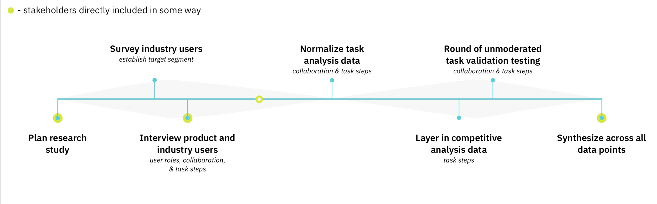
Key methods: Survey, interviews (moderated + unmoderated), task analysis (moderated + unmoderated), competitive analysis, validation testing.
First, we defined our target segment. The team had been working from a single persona for years, but a persona which we lovingly referred to as suffering from multiple personality disorder. So we couldn’t start there. Our first step was to get a broad understanding of what kinds of people are involved in creating/editing marketing communications. We conducted a hybrid survey / unmoderated interview series in order to define those users. This allowed us to be more accurate with our user segmentation for the rest of the study.
This hybrid survey/interview was conducted with 50 industry users. We screened for anyone who mentioned any involvement with creating/editing marketing communications in their current role. We received a wide range of responses, but the majority had some key characteristics which allowed us to narrow our upcoming outreach.
View a few highlighted samples below:

After laying the groundwork, we ran moderated interviews with our clients, unmoderated interviews with industry marketers, and in-depth task analyses as part of both.

We used semi-guided card sorts to help us quickly review the task analysis data.
We also took the data from the card sorts and compared the recorded task steps to what we found in competitive analysis. The tasks recorded when reviewing competitors were normalized before comparison. For example —

We found that the workflow for creating communications in our platform was drastically different from the industry.

Our user’s workflow
Our clients all had slightly different processes, even different from each other - because each client had their own workarounds to resolve the blatant usability and workflow issues which our product had created.
Industry user’s workflow
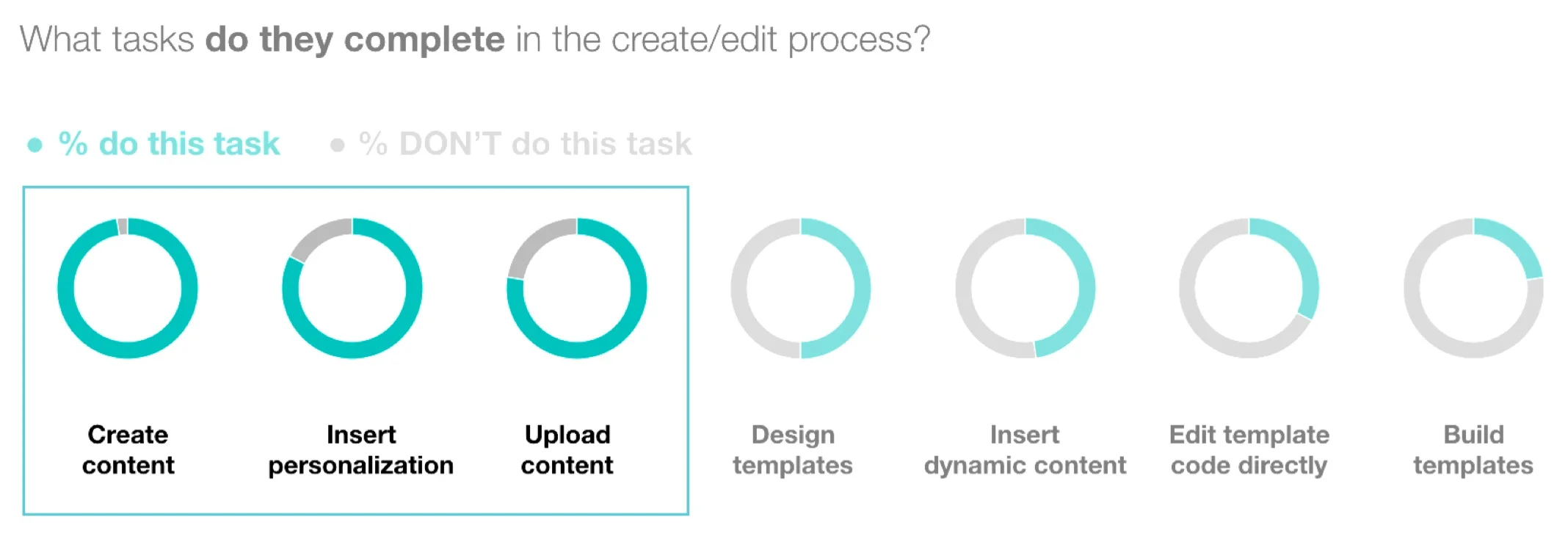
Task analysis of the ~30 industry marketers we interviewed showed a similar workflow for all of them. The amazing part is that there was a strong pattern, even though they were segmented into groups - each utilizing a different one of our competitors.

We also found that there were strong similarities across channels. The process for creating an email is not too dissimilar from creating a mobile app inbox message.
Our clients were saying —
It’s pretty obvious that a couple of the tools were acquisitions that are just plugged in, but not truly integrated. Too many features, all separate UX.
Meanwhile, our competitors were bringing together the process of creating for these channels into one continuous workflow. It was clear that we needed more than just a facelift.
This is a request we heard again and again from users. Needing consistency. We walked away with a lot of details about the processes, how our process clearly didn’t align with the industry process.